100 years of Mazda logo, from serving World War II to a long-standing car company
The history of changing and renewing the Mazda logo has also been ups and downs and has changed a lot throughout the brand’s history.
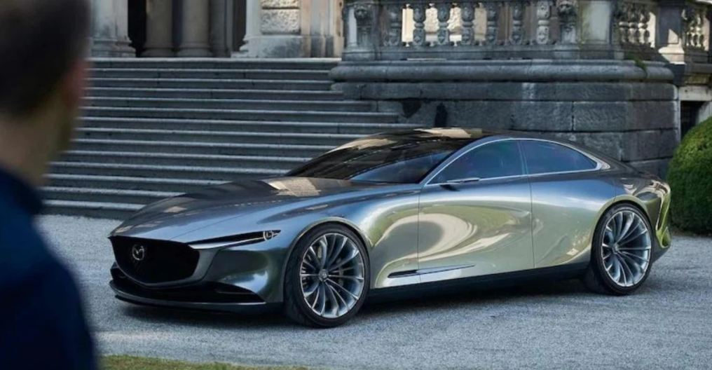
Mazda is a long-standing car brand in Asia and the world
However, not everyone knows that Mazda has changed and renewed its logo 7 times, before introducing and applying the impressive design currently available on publications, media and of course, current car models.
Every small change in each Mazda logo design refresh originates and is inspired by the drastic changes of the times or Japanese culture.
The first Mazda logo in history
Mazda Motors Corporation was originally the Toyo Cork Kogyo manufacturing company, founded in 1920 in Japan. By 1929, the company officially put into operation a factory located in Hiroshima.
Manufacturing for World War II was of course not a sustainable field. Just a few years later, the company was on the brink of bankruptcy because it could not maintain the factory’s operations. Fortunately, many banks and financial institutions in Hiroshima at that time “reached out” to save the fate of Toyo Cork Kogyo.
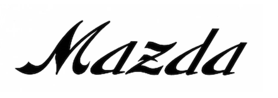
The first Mazda logo in history
In 1934, the company switched to assembling and manufacturing trucks and specialized three-wheeled vehicles for military use. They named their first series of products Mazda-go, three-wheeled vehicles specializing in transport with 250cc engines and a payload of up to 200kg.
The first Mazda logo in history was simply the word Mazda handwritten, with soft lines and somewhat exuding a classic feel.
The next Mazda logo witnessed a painful period for Japan
Around the early 1930s, the Mazda three-wheeled transport brand began to nurture greater ambitions. A typical example was the project to develop the first small-sized car, which was launched in 1934.
This was also the time when the company name, brand name and even the new Mazda logo design were born. The company was renamed Mazda Motors Corporation, the new Mazda logo design was a stylized image of three M letters – the abbreviation of Mazda Motors Manufacturer.
The elongated detail of the three M letters was intended to evoke the image of wings, symbolizing the ambition and desire to fly far of the brand team. By 1940, the prototype design of the first car developed by Mazda was also launched.

The next Mazda logo saw Japan plunge into crisis
However, the belief that Mazda would soon “commercialize” the first personal car model quickly collapsed. In 1945, as a move to wipe out and destroy the enemy’s resistance after World War II.
The US military created a nuclear massacre that was considered one of the most shocking in human history. Two bombs were dropped on Hiroshima and Nagasaki, respectively, taking the lives of hundreds of thousands of innocent people.
The massacre also caused the two cities to suffer direct destruction, as if returning to the pre-industrial era. The factory and all activities of the Mazda brand of course suffered the same fate.
The project to develop and introduce the first personal car product of Mazda Motors Corporation was postponed and production stagnated for more than a decade.
The third Mazda logo marks the inheritance period
During the early years of economic reconstruction and recovery after the nuclear disaster, the Mazda brand of course did not make many clear marks in the market.
Their most important and memorable event was probably the time when the current President Jujiro Mazda was no longer in office, leaving his son Tsuneji Mazda to take over and inherit all the important activities of the company.

Mazda logo marks the company’s succession period
The new Mazda logo design was also born, but of course it was more like a part of history, instead of being popular and appearing on official products or media.
This new Mazda logo design is relatively modern, angular but unfortunately did not leave much of an impression, was quickly forgotten and did not touch the emotions of most consumers at that time.
The Fourth Mazda Logo and the Rapid Reconstruction
Just four years after the disaster of the century, Mazda officially returned by being allowed to export three-wheeled transport vehicles to Europe. The Mazda logo was therefore forced to change, to better suit and adapt to a potential market.

New Mazda logo with stronger and more solid letters
The new Mazda logo is similar to the first logo in history, just the familiar Mazda lettering, but this time, the letters are somewhat stronger and more solid, compared to the flexibility, softness and somewhat weakness of the old design.
In 1950, Mazda marked an equally important turning point. The project to develop and produce personal cars officially returned.
The fifth Mazda logo and the Japanese automaker’s first car product
The car world knows the Mazda brand widely after models such as the RX-7, RX-8 or MX-5. But the first personal car model developed and produced by Mazda is the compact R360 Coupe with many paint color options.
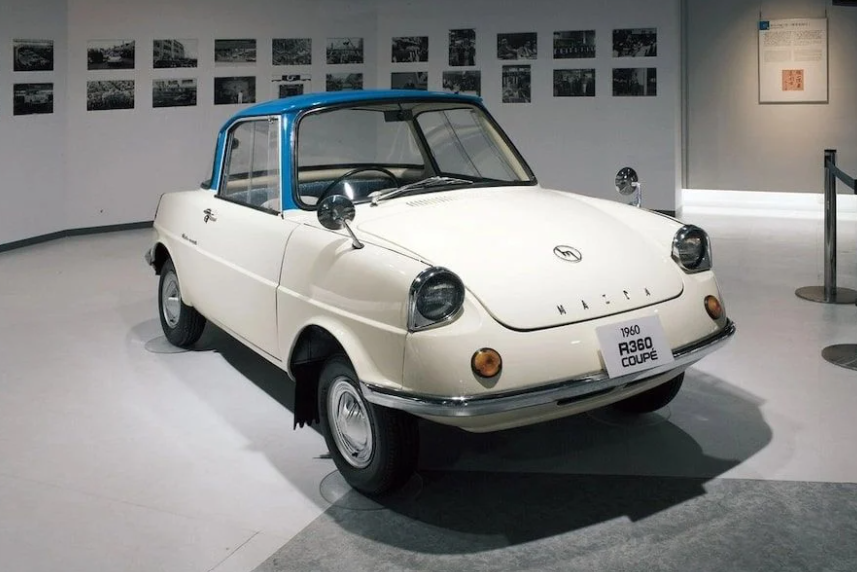
The Mazda R360 Coupe that made the Japanese brand famous
Exactly ten years after returning to the personal car production project, Mazda has released the first R360 Coupes, with a new Mazda logo design on the hood.
This is the fifth Mazda logo design in the history of the Japanese brand, possessing a minimalist and modern style similar to the logo design of 1951 – when Tsuneji Mazda inherited the company to replace his father in running all operations.
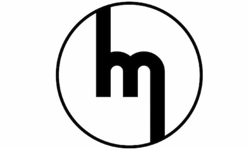
Mazda logo design appears on R360 Coupe
Although the R360 Coupe is only a car model exclusively for the Japanese market, the achievements it brings are by no means modest. More than 4,500 orders were recorded on the first day of registration. At one point, the R360 Coupe even accounted for more than 15% of the total Japanese domestic car market share, of which 2/3 were cars exclusively for the domestic market.
The Sixth Mazda Logo Returns to the Old Design
In 1975, the Mazda logo continued to change and introduced a new design. They returned to the old style when only using a wordmark to represent the brand name.
Of course, this time Mazda used a simpler, more solid font but still strongly reminiscent of the spirit of speed and sustainability. This is the longest-used Mazda logo design since World War II.
The Mazda logo was used until the end of the 20th century
Specifically, the Mazda logo wordmark was written in all lowercase, black letters with two dashed Z lines were used from 1975 to 1997. After that, this Mazda logo continued to be used until the end of the 20th century, only changing to blue with the brand logo.
Responding to the arrangement of the letters in the brand name in lowercase, except for the letter D which is capitalized, Mazda said that they wanted to show solidity, prestige and reliability right from the Mazda logo design.
Therefore, the design team sought to arrange the entire wordmark within a rectangular frame. Then the lowercase letter D would create a distortion that would defeat the team’s intention. That is why all the letters are in lowercase, except for the uppercase letter D.
New Mazda logo used until 2015
In June 1997, the Mazda logo was researched and improved, creating a meaningful symbol to be placed next to the familiar brand name wordmark, instead of using a combination of abbreviations or monotonous handwritten lines as before.
The new Mazda logo includes two elements, in which the familiar Mazda wordmark is retained and only changed to blue. Accompanying this is a completely new logo, which represents the true value and complete culture of the Mazda brand.
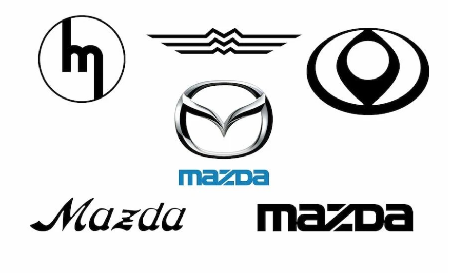
The first Mazda logo used a winged symbol
The new symbol in the Mazda logo is a stylized M placed in a circular arc. The M is spread out to create an abstract image of a pair of wings, expressing the bravery of the Mazda brand in facing all difficult challenges.
These wings combine with the circular arc to create an endless loop, meaning that this brand will never stop growing and flying far. Staying true to the philosophy and culture of the brand to bring sustainable value to consumers.
Mazda logo from 2015 to present
Back in 2010, after many months of consideration and even struggle, Mazda’s design team boldly put aside the old Nagare design language to launch a completely new KODO design style.
This is considered the most important factor in strengthening the company’s sales growth momentum. In which, Mazda 3 has been the default symbol of KODO design language for many years, bringing in sales of more than 1 million units/year in North America alone.
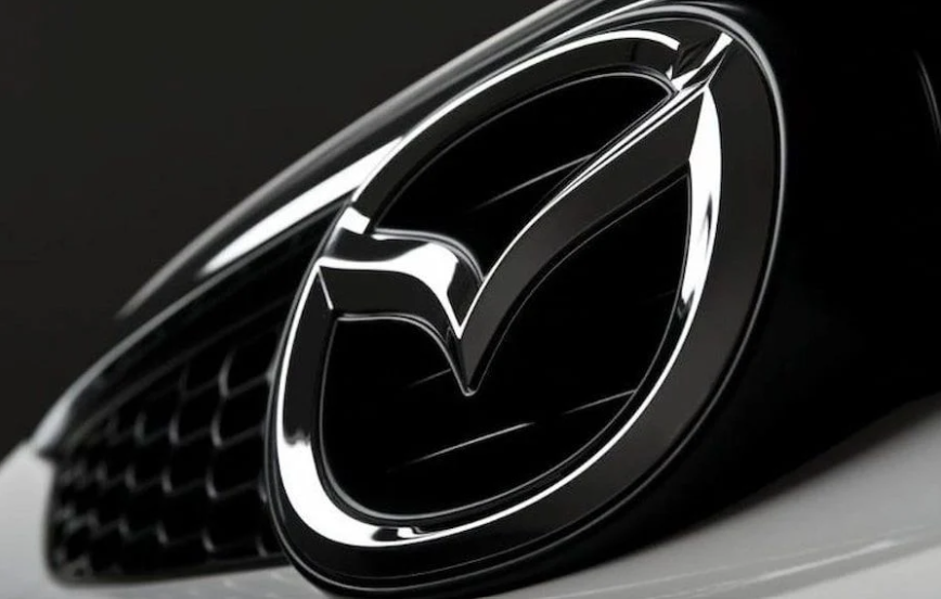
Mazda logo used at the present time
Changing the product design style is one thing, but changing the Mazda logo design is also an equally important task. In general, the new Mazda logo design does not have too many changes.
The biggest change is probably the way the physical product is finished and the color of the logo. The new design has a more matte and smooth color treatment style, creating a luxurious, modern feel and suitable for a brand pursuing a youthful and liberal style.


