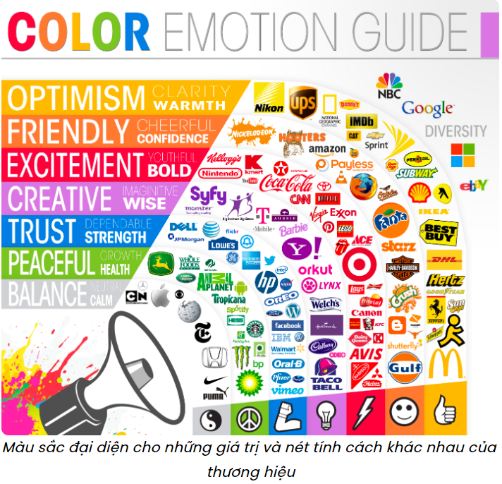
Color psychology in marketing – helping brands increase website purchase rates
In branding and website design, color plays an important role in attracting customers and increasing conversion rates. According to data published by WebFX, customers often make an overall assessment of a website after 90 seconds of visiting, and 62% – 90% of those assessments are based on color. That is also the reason why brands need to have a smart strategy in choosing colors that match the business’s goals and customer base, thereby increasing brand recognition and promoting purchasing decisions.
So what is color psychology and how does it affect customers’ purchasing decisions? How to effectively apply color psychology to website building and design? Let’s find out through the article below.
The Concept and Role of Color Psychology in Marketing
Color psychology is the study of how colors affect human perception, attitudes, behavior, and decision-making. In the field of marketing, a study has shown that color psychology can increase brand recognition by up to 80% and influence 85% of customers’ purchasing decisions. That is why it is considered an effective marketing tool, affecting the way buyers feel about different brands and products.
Factors influencing the choice of brand colors
First of all, the choice of colors for a brand often comes from the target customer and the demographic characteristics of this audience. By identifying factors related to gender, age, culture and purchasing habits, brands can calculate and choose the color that brings the greatest appeal to the brand and attracts target customers.
1. Gender
According to a study published by Kissmetric, blue is the favorite color of most male customers and more than ⅓ of female customers. If the brand’s products and services are aimed at all gender groups, potential colors that the brand can choose are blue, green or red. In addition, the brand can also create accents with neutral colors such as black, white and gray.
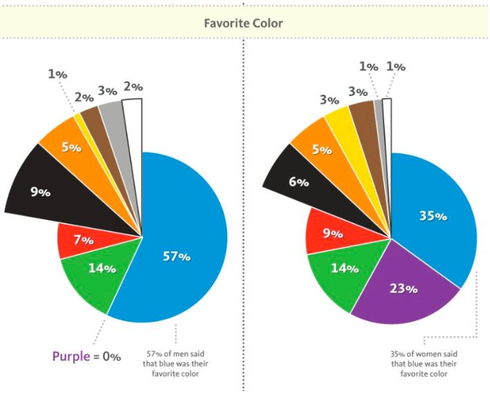
According to this study, the color that is most clearly differentiated between gender groups is purple, with 23% of women and 0% of men liking this color. Therefore, purple is a great choice if the brand’s products and services are aimed at female customers. Choosing colors that match the gender of the target audience will help brands create visual content for their brand identity and website.
2. Age
The difference in customer age also affects the level of preference for different colors. Younger customers are often attracted to colors with high contrast with distinct light or dark tones. Primary colors such as blue, yellow and red also tend to cause a stronger reaction from this customer group. The older people are, the more they tend to shift their preference to lighter tones and less contrast.
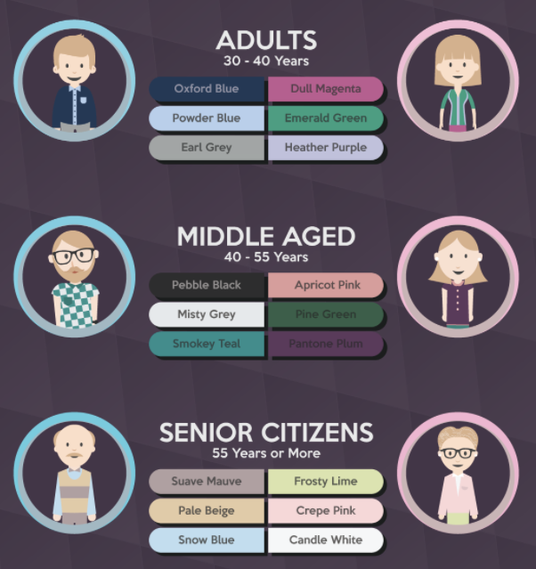
Some suggestions for favorite colors for different age groups (Source: DesignMantic)
3. Culture
Some colors have different meanings in different countries. Therefore, choosing colors based on cultural characteristics is an extremely important factor that brands need to consider when approaching their target customers. For example, Americans and British people consider blue to be a positive color, evoking patriotism and a sense of peace. Meanwhile, the meaning of this color is completely different in Iran, where blue is associated with mourning.
4. Purchasing behavior
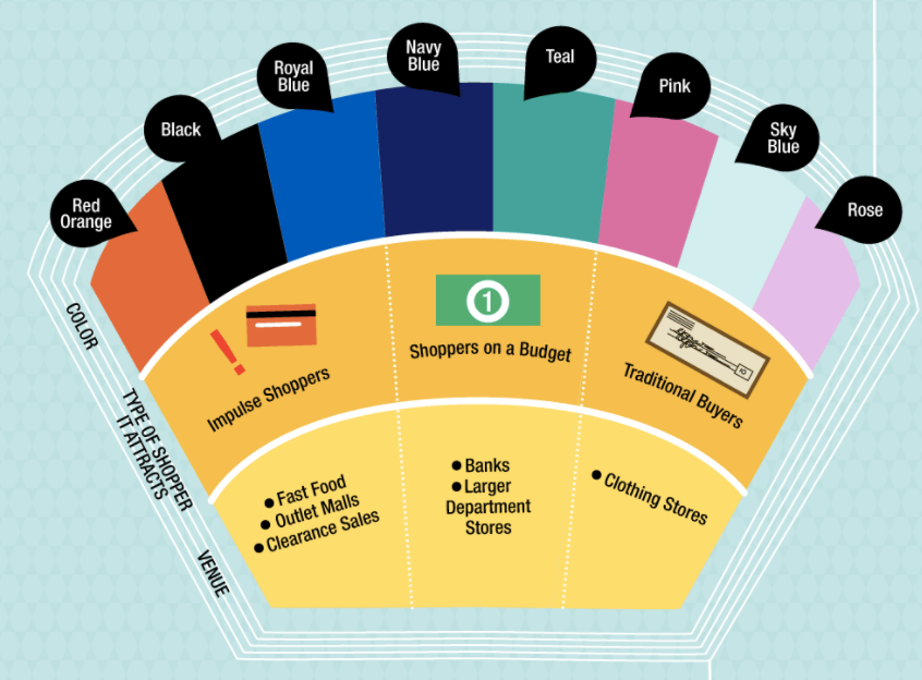
Kissmetrics data also shows that colors affect the psychology and purchasing behavior of customers. People with strong personalities and impulsive buying behavior are often attracted to red, orange, black and royal blue. People who tend to shop on a budget often love navy blue and teal. Meanwhile, lighter tones like pink and sky blue will appeal to traditional shoppers.
Applying color psychology to building a brand website
Each different color will have a different meaning. Understanding the color psychology of customers will help brands improve conversion rates and build websites effectively. Below are the specific meanings of some basic colors that brands can refer to.
Blue
As the most popular color, it is no surprise that blue represents many different benefits. Shades of blue often symbolize protection, loyalty, and responsibility. That may be why financial institutions like PayPal, Visa, and Bank of America incorporate blue into their branding and website design. Despite being a popular and widely used color, some studies have shown that blue represents a natural appetite suppressant. Therefore, it is rarely used in the culinary field.

Paypal’s website interface is designed based on the color blue to increase customer trust in the brand
Using blue for the call-to-action (CTA) button will make the brand more valuable and trustworthy in the eyes of customers.
Yellow
Yellow is often used in many warning and traffic sign contexts. In addition, according to The Logo Factory, this is also the color associated with sunlight, promoting feelings of optimism and joy. For that reason, they are often used to attract customers’ attention.
However, this color also has a serious drawback related to readability. When standing alone, yellow is almost impossible or very difficult to read. Therefore, the advice for brands to apply this color effectively in website design is to consider using it as a background color for CTA buttons and choose a contrasting color, such as black, for the text content inside.
Brands often combine yellow with borders or display text in a contrasting color to make the logo stand out more
Red
According to WebFX, red has a strong impact on shoppers’ emotions. In marketing, red is often used to increase pressure, create urgency and arouse passion. This is also a color that has been proven to be effective in stimulating appetite. Therefore, many brands in the culinary field have chosen red to attract customers, including Coca-Cola, Lays or KFC.
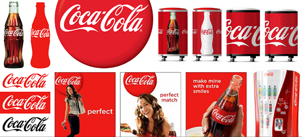
Red is associated with Coca-Cola in all of the brand’s designs
Brands should take advantage of this color by adding red next to or with urgent messages or creating high pressure for purchasing decisions.
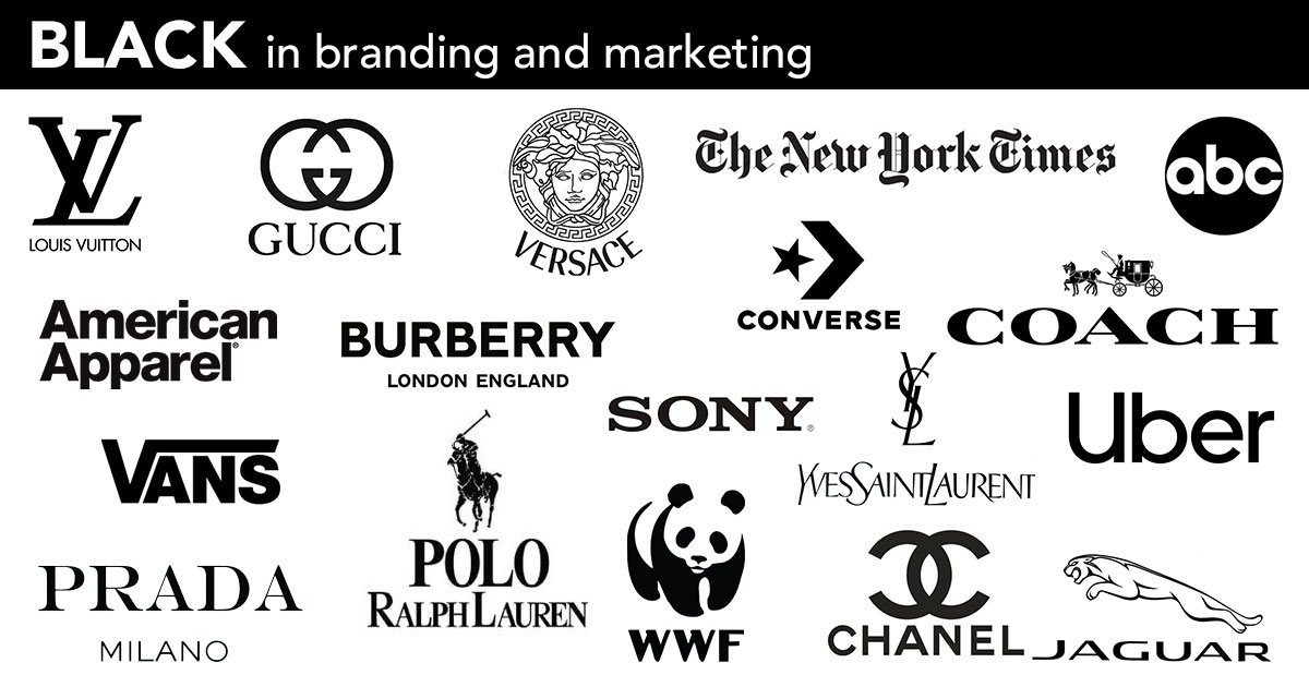
Black
Although black is sometimes associated with negative connotations, it is a color often used by luxury brands. In addition to being mysterious, this color evokes elegance, luxury and sophistication. In color psychology, black represents authority, power and prestige. This explains why Prada, Rolls Royce and Chanel all use black in their logos.
If a brand wants to make an important or serious announcement, black, especially when used with bold fonts, can create an impression and attract customers’ attention. In addition, brands also need to skillfully combine this color on the website to avoid bringing a heavy, negative feeling.
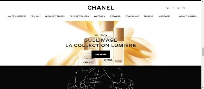
Chanel is very clever when combining black and white into the website design, creating a pleasant feeling and highlighting the luxury of the brand
White
White represents cleanliness and minimalism, while bringing a sense of luxury to the brand. To use white effectively, add more white space to your landing page and use it as the main color for the CTA button in case the brand website has a dark background color to create contrast.
The combination of two colors white and black brings a minimalist and luxurious feeling
Using color to increase the conversion rate on the brand’s website?
According to Neil Patel Digital, below are the steps that brands can apply to effectively build a website based on color psychology.
1. Analyze the overall color scheme on the brand website
Before starting to change the colors on the website, it is important for brands to understand the purpose of the design and the color scheme that the brand is using. Choose colors that have meanings that match the values and spirit of the brand, thereby creating a better impression in the eyes of customers.
2. Choose contrasting colors
Bold and contrasting colors often play a very important role in creating conversion rates. No matter what colors a brand uses, think about how to express and combine them on their website. Brands should create a separate color for CTA buttons to make them stand out more in the eyes of customers.

Dropbox uses a prominent blue color on the black background of the website for the call to action buttons to register and use the service
3. Split test and make improvements
This is the final but also the most important step that affects the improvement of the brand website conversion rate. After making changes to the color on their website, brands need to monitor, evaluate and test to continuously improve and perfect the most optimal interface. From there, the brand can improve sales, the number of subscribers and revenue for the brand.
For example, Smashing magazine tested various CTA button formats and content on its website. Different CTA buttons varied in text size (small or large), color (red or blue), and text length (using the phrase “Download For Free” or “Download”)
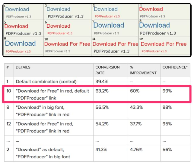
The test results showed that the “Download For Free” CTA button, displayed in red and with a small size, helped this website improve its conversion rate by up to 60%, surpassing even the largest text displayed in blue. One of the main reasons is that the red text creates a contrast to the overall color scheme of the magazine website.